Archive for March, 2011

More on real interest rates in Europe

levyadmin | March 29, 2011

Charts in last week’s entry, which contained approximations of  real interest rates for various European countries, were unfortunately incorrect.  The problem resulted from a silly mathematical error in the formula used to calculate the figures shown in the graphs. Accordingly, the author has recently uploaded a new version of the post, including corrected diagrams. He apologizes for the errors and any confusion they may have caused.

Comments


Krugman, Galbraith, and others debate MMT

Greg Hannsgen | March 28, 2011

Paul Krugman slugs it out with our colleague Jamie Galbraith and many other “modern monetary theory” partisans at Krugman’s New York Times blog website. Jamie’s most recent retort is at the top of this page of the blog site. Many of the points raised in the discussion there are central to our work here at the Levy Institute and to the views of Galbraith and others in our macro research group.

Update: More links to the ongoing Krugman-MMT debate can be found here.  -G.H., March 31.

Update, August 11: Krugman on MMT again, this time drawing lessons from French fiscal policy between World Wars I and II.

Comments


How Tight Have ECB Policies Been in Real Terms?

Greg Hannsgen | March 24, 2011


(Click picture to enlarge.)

Readers may have seen two charts that are part of a column by David Wessel published last week. For five European countries, they compare actual interest rates with those prescribed by a standard policy rule. Wessel’s charts provide some interesting evidence that European Central Bank monetary policy has been either too loose or too tight most of the time for several currently ailing European economies, given these countries’ inflation rates and gaps between actual and potential output.  Wessel’s charts support the article’s theme, which is that severe economic problems in some Eurozone countries result in part from the “one-size-fits-all” interest rate policies of the ECB.

Along the same lines, at the top of this entry is a chart of short-term “real interest rates” faced by business borrowers who use overdraft loans in a group of European countries, which are mostly members of the euro area. I have used data on interest rates for this common type of loan, adjusting each month’s observation to reflect the same month’s measured consumer price inflation, so that the resulting “real rates” take into account inflation’s effects on the burden of loan payments. Inflation is helpful to debtors because it has the effect of reducing the amount of goods and services represented by each dollar owed under the terms of a loan. Of course, I have used only one of many possible methods that one could employ to approximate real interest rates.  Moreover, to construct a true real interest rate data series, one would need to know borrowers’ forecasts of the inflation rate, which is an impossible requirement in most circumstances. Hence, these series and others like them usually need to be taken with a grain of salt.

As theory would have it, real interest rates in different countries tend over the long run to converge on a common value, a result known as “real interest rate parity.” This convergence is assured only under certain exacting conditions that are clearly not met in the case of the numbers depicted in the chart. Nonetheless, the degree to which the rates differ may provide another indication of the disparities in credit costs that are imposed by a unified central banking system. Moreover, the chart shows that some of the countries now experiencing fiscal crises have been suffering the effects of particularly tight credit conditions. For example, Greece’s real interest rate was 20.49 percent in January, as indicated next to the green line representing the Greek data. Real rates for Ireland and Portugal, two other countries whose governments’ financial problems have recently been in the news, are also shown in the figure.

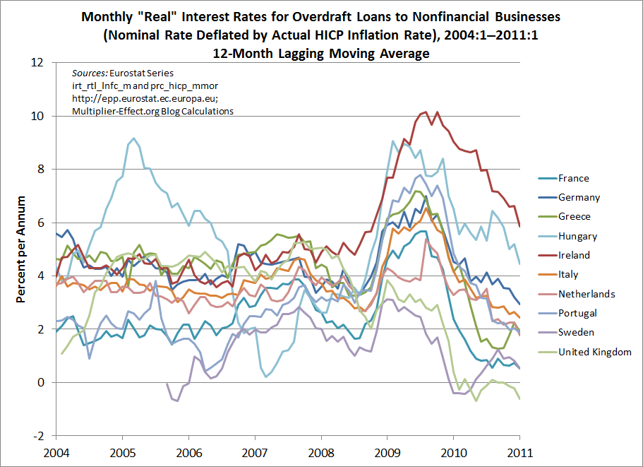
My next chart shows lines for all of the aforementioned countries, plus 7 others, containing points that are constructed by averaging the last 12 months’ observations from the first chart.  This removes most of the effects of regular seasonal patterns and helps to highlight longer-run trends, which would otherwise be obscured by the extreme volatility of these series. As a result, we are able to include data for 10 European nations in this figure.

(Click picture to enlarge.)

The data underlying the figures are harmonized European statistics, which are meant to be somewhat comparable across national boundaries. Nevertheless, the ten series in the figure seem to show no signs of converging, though their movements appear to be highly correlated over the past three years. According to the averaged data, Irish real interest rates have been the highest among the 10 European economies represented in the graph since approximately spring 2009. In January, the unaveraged real rate in Ireland exceeded 9 percent.

Like Wessel’s diagrams, the ones above show that despite centralized interest-rate setting, one measure of the tightness of policy for actual retail borrowers varies greatly across eurozone economies.

Notes:

continue reading…

Comments


Some Interesting Charts and Arguments on the Deficit Issue

Greg Hannsgen | March 21, 2011

Some more thoughts on the federal debt, which I blogged about last week: First, at Barry Ritholtz’s blog, there are some other interesting figures: one portraying the gross federal debt in three different ways and another breaking the gross debt down by holder. Ritholtz’s figures use data from the U.S. Treasury Department. Note that the gross debt, which stands at a little over $14 trillion, includes around $3 trillion in securities held by the Social Security and Medicare trust funds. (See Trustees’ report.) These securities are not treated as federal liabilities in flow-of-funds data, the main source for the figures in my earlier post. This difference between net and gross numbers accounts for most of the apparent gap between the figures reported in Ritholtz’s blog and those reported here. Like the Federal Reserve’s portfolio of Treasury securities, the securities owned by the trust funds are essentially both assets and liabilities for the broader federal sector, and for macroeconomic purposes, it is best to net them out in my opinion. This leaves well below $10 trillion in federal debt to the public, according to both flow-of-funds data and the Treasury Department website. Regardless of the exact size of the federal debt, which is not crucial, the point to note right now about the deficit issue is that the economy does not appear to be showing signs of excessive government borrowing. We at the Levy Institute will be writing more about this in the near future.

Along these lines, it was good to see Bill Mitchell’s recent article on the deficit in The Nation. Many of the points raised by Mitchell are crucial to the deficit debate and well expressed in the article.


Comments


Data Show Increased Fed Role in Financing Federal Debt

Greg Hannsgen | March 15, 2011

(Click on graph to enlarge.)

Some interesting information on the federal government’s balance sheet can be gleaned from the fourth-quarter flow-of-funds report, which was released by the Federal Reserve Board on the 10th of this month. The total amount of all federal liabilities, as reported by the Fed last week, is shown as the sum of the red and blue areas in the figure above. The blue portion of the graph represents net liabilities owed by the federal government to the Federal Reserve System, while the red portion shows the rest of the federal government’s liabilities. The blue portion is best netted out of the total debt when one is calculating a figure to be used for policy purposes, as it essentially represents a sum of money that one part of the federal government owes to another. (The Fed describes itself in its educational literature as “independent within the government,” though it is shown in flow-of-funds reports as a separate entity with a separate balance sheet from that of the federal government.)

As noted in the figure above, total federal liabilities, according to the new data, rose in the fourth quarter of 2010 to 75.0 percent of seasonally adjusted U.S. GDP from 72.6 percent the previous quarter. Of this 2.4 percentage-point increase, 1.6 percentage points were accounted for by an increase in net Fed holdings of federal government liabilities, while all other entities increased their combined holdings of these liabilities by only about nine-tenths of a percentage point. Hence, ignoring the more-of-less irrelevant holdings of the Fed, the federal debt stood at approximately 65.5 percent of GDP as of the end of last quarter.

When the Fed purchases federal government liabilities using its open market account, it is swapping money for debt securities, so that economic sectors other than the Fed and the federal government wind up holding more U.S. currency and/or reserve deposits and fewer interest-bearing U.S. liabilities than before. This helps the Fed keep interest rates lower than they otherwise would have been as the total debt rises. Dimitri Papadimitriou and I discuss the increased use of this “financing” strategy in a recent working paper.

A couple of minor technical points: These figures are approximate and do add up in some cases because of rounding. Also, the Fed liabilities data are not seasonally adjusted, though, as noted above, I have divided them by seasonally adjusted GDP figures from the FRED database at the St. Louis Fed website.

Revised to improve clarity by G. Hannsgen on March 17, 2011 at approximately 8:20 am. Specifically, I have clarified the point that the blue portion of the figure, representing federal government liabilities to the Fed, is a net amount. In other words, it shows the amount of federal liabilities to the Federal Reserve System minus the amount of liabilities that the Fed owes to the federal government, all divided by GDP and expressed in percentage terms. Some discussion of this point might have been helpful. To wit: most of the federal government’s liabilities to the Fed are Treasury securities; an example of the opposite variety would be one or another of the several “bank accounts” that the government holds at its central bank. To determine how much the federal government owes the Fed, one must subtract the balance in these bank accounts and the like from the government’s gross liabilities to the Fed. It is only such net amounts that are shown in the blue portion of the figure above. Those figures are in turn subtracted from total federal liabilities as reported in quarterly flow-of-funds data to yield approximations of the quarterly “true” federal debt, which are, of course, depicted by the red area in the picture.

Comments