More Confusion About Eurozone Debt
The Washington Post is casually informing its readers that the eurozone’s austerity programs are really aimed at addressing all that government profligacy everyone knows was rampant in the run up to the crisis.
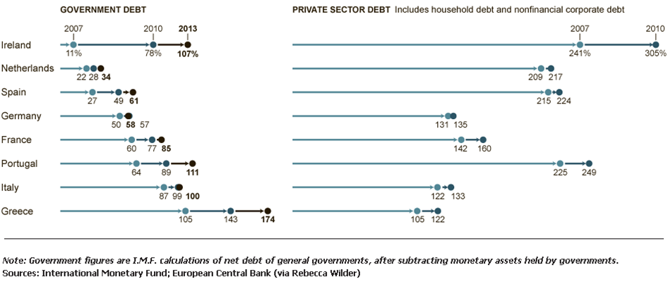
This seems like another good opportunity to post this chart, showing net debt as a percentage of GDP in some key eurozone countries, pre and post crisis (click to enlarge):
As you can see, for almost all of these countries the crisis was largely a cause of rising public debt ratios, not an effect. Spain, which as the Post article notes is the latest country on the eurozone hot seat, had a public debt-to-GDP ratio of 27 percent in 2007 (and as Dean Baker points out, Spain was running a budget surplus). Reckless!
If you’re really looking for a debt-related problem in the buildup to the crisis, take a glance at the right-hand side of the chart. There you’ll see private debt ratios at significantly higher levels. For more on this and the real story behind the problems in the eurozone, see this policy brief by Dimitri Papadimitriou and Randall Wray (short version here).
Update: Paul Krugman adds more (responding to a piece in the FT by Kenneth Rogoff) by posting a graph showing the trend in public debt ratios in the eurozone periphery during the 2000s. As you can see, 2007 represents the trough in a long, steady pre-crisis decline in public debt-to-GDP ratios among the GIPSI countries. This is the very time period in which we are being told that government budgets were “ballooning” out of control.


 ShareThis