Archive for the ‘Fiscal Policy’ Category

A New Peek at the Secrets of the Fed?

Greg Hannsgen | February 2, 2011

In December, the Levy Institute issued a working paper that asked how the economy might be affected by the seemingly unusual fiscal and monetary policies implemented by the Fed and other central banks since 2008. The authors, Dimitri Papadimitriou and I, used a phrase that is not often spoken in this era by governments and central banks around the world: “monetizing the deficit.” This phrase traditionally describes the practice of financing a government deficit with money that is “printed” rather than borrowed or raised by taxation. We feel perhaps a little more comfortable with our use of these words in light of a recent blog entry on the Financial Times website Alphaville. The blog reports that the Fed has come close to running out of securities to buy in the markets for certain types of government bonds, having bought so many of them already. Hence, it is increasingly resorting to the purchase of recently issued bonds and notes, which it had apparently sought to avoid. This development makes the link between deficit spending and monetary policy initiatives such as the current round of “quantitative easing” in a monetary system like ours easier to grasp. If the Fed buys a Treasury security almost immediately after it is issued, there is less reason than ever to think of the financing process as anything other than the use of the Federal Reserve’s “printing press” to pay for government operations–an essential use of “monetization” to stimulate the economy and avoid drastic fiscal measures during a time of weak tax revenues. Some worry still, but this practice has been used many times by numerous governments around the world and seems unusual only in light of common but unrealistic beliefs about monetary systems and how they normally work. Hence, those in Congress should not give credence to arguments that it is necessary to eliminate entire government programs or freeze major parts of the federal budget in order to restore some fanciful state of budgetary normalcy.

February 10 addendum on recent news: A short and interesting article on the implementation of quantitative easing policies was posted very recently on the New York Fed’s website. The article mentions changes in the composition of the Fed’s asset purchases, including the recent increase in purchases of newer issues that was reported in the Alphaville blog entry linked to above.  On the other hand, the new piece, based on a speech by a Fed official, finds no evidence that the Fed’s purchases have caused “significant market strains.” The article covers some other important issues associated with the recent policy actions involving long-maturity securities and might be interesting to people wanting detailed information about these topics.

Comments


Long-Term Interest Rates Brought Up to Date

Greg Hannsgen | January 21, 2011

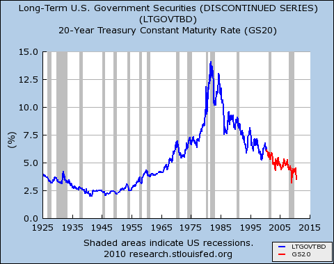
U.S. Long-Term Government Bond Interest Rates, 1925-2010

Last summer, this blogger posted a graph showing the path followed by U.S. long-term interest rates since 1925.  There has been some interest in a new and updated graph, especially in light of concerns that bond markets might soon demand higher yields as the economy expanded. One appears above. Reasons for apprehension about a possible jump in yields vary and include large federal deficits, which increase the amount of bonds that must be absorbed by the market, as well as concerns about a possible resurgence of inflation driven by quantitative easing (QE) and a near-zero Federal Funds rate.  The Financial Times [homepage link] and some other newspapers have been reporting recently on a perhaps greater threat to price stability worldwide: a continuing run-up in the prices of some key agricultural commodities, brought about mostly by factors other than macroeconomic policy.  There has been some discussion of rising yields for long-term government bonds, but the long-term perspective offered by the figure above shows that interest rates remain very low by historical standards, at least for now.

Moreover, real yields on federal inflation-indexed securities remain quite low indeed, and in some cases negative, as shown, for example, by the green line in the figure below. Broadly speaking, such yields are what markets expect certain inflation-protected bonds to yield in addition to compensation for inflation.  Hence, they can be viewed as indicators of the costs of borrowing after expected inflation is taken into account. These costs have apparently been trending downward since 2008. (Some related but different interest rate series remain in positive territory, including for example one type of ten-year inflation-indexed bond issued early last year, which is yielding a little over .8 percent. By the way, the red line in the graph below shows only the most recent data points from the figure at the top of this post. This  longer-term nominal rate is not comparable to the inflation-indexed series depicted by the other line.)  These data show that recent Fed efforts to ease the terms on which money can be borrowed in a time of large deficits have continued to prove efficacious in a way that many economists find puzzling, though it is unlikely that these monetary policy actions alone will have a large impact on the rate of economic growth.

Nominal Interest Rate (shown in red) and "Real Rate" (shown in green)

Comments


Federal Pay Rates Frozen; How High Are They Now?

Greg Hannsgen | December 1, 2010

Yesterday, the Obama administration announced that it wants to freeze wages and salaries earned by federal government employees in calendar years 2011 and 2012. Most federal workers might otherwise have received a cost-of-living raise at the start of the new year. There has been some controversy about whether these workers are overpaid. In this post, I report some information that I have gleaned from the web about the pay scale for most white-collar positions in the federal government, which is known as the “general schedule” (GS).

The government’s Office of Personnel Management (OPM) states that “the General Schedule (GS) classification and pay system covers the majority of civilian white-collar Federal employees (about 1.3 million worldwide) in professional, technical, administrative, and clerical positions…”

For 2010, the pay scale for federal GS employees is shown in the table below. This is the table for employees who work in geographic areas where the cost of living is not unusually high. An explanation of the table follows.

Grade Step 1 Step 2 Step 3 Step 4 Step 5 Step 6 Step 7 Step 8 Step 9 Step 10
1 17803 18398 18990 19579 20171 20519 21104 21694 21717 22269
2 20017 20493 21155 21717 21961 22607 23253 23899 24545 25191
3 21840 22568 23296 24024 24752 25480 26208 26936 27664 28392
4 24518 25335 26152 26969 27786 28603 29420 30237 31054 31871
5 27431 28345 29259 30173 31087 32001 32915 33829 34743 35657
6 30577 31596 32615 33634 34653 35672 36691 37710 38729 39748
7 33979 35112 36245 37378 38511 39644 40777 41910 43043 44176
8 37631 38885 40139 41393 42647 43901 45155 46409 47663 48917
9 41563 42948 44333 45718 47103 48488 49873 51258 52643 54028
10 45771 47297 48823 50349 51875 53401 54927 56453 57979 59505
11 50287 51963 53639 55315 56991 58667 60343 62019 63695 65371
12 60274 62283 64292 66301 68310 70319 72328 74337 76346 78355
13 71674 74063 76452 78841 81230 83619 86008 88397 90786 93175
14 84697 87520 90343 93166 95989 98812 101635 104458 107281 110104
15 99628 102949 106270 109591 112912 116233 119554 122875 126196 129517

Each row in the table shows the annual salary in dollars for a particular pay “grade.” The OPM explains GS pay grades as follows: “The General Schedule has 15 grades–GS-1 (lowest) to GS-15 (highest). Agencies establish (classify) the grade of each job based on the level of difficulty, responsibility, and qualifications required. Individuals with a high school diploma and no additional experience typically qualify for GS-2 positions; those with a Bachelor’s degree for GS-5 positions; and those with a Master’s degree for GS-9 positions.”

Each column of the table corresponds to a “step” within each pay grade. Employees who do not qualify for a promotion to a higher grade can sometimes move a step to the right along the row corresponding to their pay grade. According to the OPM, “Each grade has 10 step rates (steps 1-10) that are each worth approximately 3 percent of the employee’s salary. Within-grade step increases are based on an acceptable level of performance and longevity (waiting periods of 1 year at steps 1-3, 2 years at steps 4-6, and 3 years at steps 7-9). It normally takes 18 years to advance from step 1 to step 10 within a single GS grade if an employee remains in that single grade. However, employees with outstanding (or equivalent) performance ratings may be considered for additional, quality step increases (maximum of one per year).”

The usual annual pay raises for federal employees in this compensation system are explained next:

“The GS base pay schedule is usually adjusted annually each January with an across-the-board pay increase based on nationwide changes in the cost of wages and salaries of private industry workers.”

Also, “most GS employees are also entitled to locality pay, which is a geographic-based percentage rate that reflects pay levels for non-Federal workers in certain geographic areas…”

As an example of the locality pay earned by workers in many areas with high costs of living, here is the 2010 schedule for GS employees in the “New York-Newark-Bridgeport, NY-NJ-CT-PA” metropolitan area, one of the most expensive places to live in the United States:

Grade Step 1 Step 2 Step 3 Step 4 Step 5 Step 6 Step 7 Step 8 Step 9 Step 10
1 22916 23682 24444 25202 25964 26412 27165 27925 27954 28665
2 25766 26379 27231 27954 28268 29100 29931 30763 31594 32426
3 28112 29050 29987 30924 31861 32798 33735 34672 35609 36546
4 31560 32611 33663 34714 35766 36818 37869 38921 39973 41024
5 35309 36486 37662 38839 40015 41192 42368 43545 44721 45898
6 39359 40670 41982 43294 44605 45917 47229 48540 49852 51164
7 43738 45196 46655 48113 49571 51030 52488 53947 55405 56863
8 48439 50053 51667 53281 54895 56509 58124 59738 61352 62966
9 53500 55283 57065 58848 60631 62414 64197 65979 67762 69545
10 58916 60881 62845 64809 66774 68738 70702 72666 74631 76595
11 64729 66887 69044 71201 73359 75516 77674 79831 81988 84146
12 77585 80171 82757 85343 87929 90515 93101 95687 98273 100859
13 92259 95334 98409 101484 104559 107634 110709 113785 116860 119935
14 109022 112656 116290 119923 123557 127191 130825 134458 138092 141726
15 128241 132516 136791 141066 145340 149615 153890 155500 155500 155500

As a macroeconomist, I must note that freezing the pay of federal employees will be somewhat detrimental to the effort by the Federal Reserve and the Administration to prevent deflation and/or a double-dip recession, because this action will reduce consumer demand. Also, freezes of federal pay unfortunately could allow private sector employers to cut pay or at least avoid raising pay for some workers who are in the same occupations as the affected government employees. Similar problems can be expected in Europe, where some governments have recently cut wages and benefits for their employees.

The quotations in this post are from this page in the OPM website More details on the GS pay scale are available there. Links to a complete set of GS pay tables like the ones shown above can be found here.

Comments and responses below:

continue reading…

Comments


A proposal for an equitable Social Security retirement age

Thomas Masterson | November 16, 2010

This idea first occurred to me while I was in France in September. I marveled that the debate they’re having (complete with effective social mobilization), is about raising the retirement age to 62. The current Social Security retirement age is 67, and the ‘serious’ proposal from Bowles-Simpson is to index it to life expectancy. This proposal sounds reasonable. But life expectancy, like income, is unevenly distributed. As Paul Krugman and Tom Tomorrow have both pointed out, life expectancy has been increasing much more rapidly for the well-off, not for the rest of the workforce.

My proposal is to implement a progressively higher retirement age for low, middle, and high-income workers. If chosen well, the tiered retirement ages by themselves could eliminate the relatively small projected shortfall twenty-five years from now. When I have time, I plan to run some numbers, but I think that such a system could lower the retirement age for low-income workers.

This proposal would allow more of those workers who do the back-breaking and health-damaging work of our society to retire while they still have some time to enjoy it. Of course, for most of the working poor, social security alone is unlikely to provide a comfortable retirement. But the point of this counter-proposal is simply to shift the burden of balancing the small imbalance in Social Security finance from those who can least afford to bear it, as the current proposal would do, to those who can.

Comments


New report JOLTS claim that extended benefits breed unemployment

Greg Hannsgen | September 8, 2010

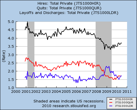
US Private Sector Hires Layoffs Discharges and Quits Seasonally Adjusted

Last week, my colleague Tom Masterson commented on an op-ed piece by Robert Barro, which argued that much of the U.S. unemployment problem―perhaps 2.7 percentage points of the June unemployment rate of 9.5 percent―could be attributed to the availability of extended unemployment insurance benefits.

According to Barro’s argument, huge numbers of people are out of work by their own choice. In fact, data released yesterday from the Job Openings and Labor Turnover Survey (JOLTS) suggest that something very different is going on. Some economic theories about unemployment are based on the notion that workers use more of their time for leisure activities or full-time job search at times when their wages or salaries are relatively low. An example would be an  ice-cream vendor who takes time off on cool or rainy days because sales are expected to be weak at such times. Along these lines, Barro has recently argued that Congressional extensions of benefit eligibility have made paid work less desirable for recipients whose checks might have been discontinued in the absence of new legislation.

The figure above shows seasonally adjusted JOLTS data on the private sector for December 2000 through July 2010. This monthly survey, conducted by the Bureau of Labor Statistics, covers approximately 16,000 nonagricultural businesses. The black line shows that the estimated “hire rate” in the private sector was 3.7 percent in July. In other words, there were approximately 3.7 new hires in private industry for each 100 current employees in that part of the economy. This compares to 4.6 as recently as late 2006.

The other data series shown in the figure may shed more light on the validity of the leisure/job search explanation for high unemployment. The blue line shows the rate of “layoffs and discharges,” a category that includes all reported involuntary separations that were initiated by the employer. This figure peaked last spring at about 2.3 percent of the private-sector workforce and had fallen to a more typical level of 1.7 percent by July. The 2.3 percent figure, reached twice in early 2009, is the highest layoff and discharge rate for the period shown on the graph. Indeed, the graph shows a prolonged period beginning in late 2008 during which the rate of involuntary separations was well above the historical norm.

Finally, the “quit rate,” shown in red, is the percentage of workers who resign in the survey month, in this case July. For the private sector, this statistic fell from 2.3 percent at the start of the recession in 2007 to 1.7 percent in July. Hence, there has been only a modest increase in this rate since it bottomed out late last year at 1.5 percent. Recent low readings stand in stark contrast to an average observation of 2.4 percent for the period spanning December 2000 to November 2007. Such low quit rates strongly suggest that fewer rather than more workers than usual have been finding new jobs or resigning to take time off for job search, vacations, or home-based activities. The new statistics depict a job market in which many employees are losing their jobs or at least believe that it will be very difficult to find new jobs if they leave their current ones.

Comments


Less stimulating than it should be

Thomas Masterson | September 7, 2010

The Free Exchange blog calls President Obama’s proposed $50 billion infrastructure stimulus “A New Hope.” Our research begs to differ. We find that spending $50 billion on infrastructure would create little more than half a million new jobs. That’s not an inconsiderable number, but it’s a drop in the bucket compared to the 14.9 million who were unemployed in August (according to the last employment situation report).

There are strong arguments to made in favor of infrastructure spending. But if the administration were to spend the same amount on social care (child care, home health care, etc.), the employment gain would be more than twice as great, reaching nearly 1.2 million.Those would be lower paying jobs, but they would go to individuals further down the economic ladder–the people, in other words, most in need of help and most likely to provide further stimulus by promptly spending their earnings.

Perhaps the president’s latest proposal is merely a political trap Obama is setting for the Republicans, giving them yet another opportunity to ostentatiously oppose something popular. If so, good luck. But after the weaker-than-needed stimulus package last year, which is now running out of gas in terms of boosting employment, this proposal won’t provide much additional job growth. Half measures, as the saying goes, avail us naught. And this proposal is much less than half of what is needed.

Comments


What’s new about QE?

Greg Hannsgen | August 30, 2010

After its last meeting, the Federal Open Market Committee, which makes decisions about Federal Reserve monetary policy, decided to keep its holdings of long-term securities constant. The Fed was forced to look again at this issue because borrowers have been paying off the long-term debt securities already in its portfolio. This maturing debt consists mostly of Treasury bonds, mortgage-backed securities, and Fannie Mae and Freddie Mac bonds, most of which were acquired quite recently. The Fed will reinvest the repayments in more long-term Treasury bonds instead of allowing its balance sheet to shrink.

Some have referred to the Fed’s acquisition of certain assets not normally seen on its balance sheet by the special term “quantitative easing,” or QE. This term is perhaps somewhat misleading, because it implies a sharp distinction between the recent policies to which it refers and the Fed’s more typical manipulations of the federal funds and discount rates. But, surprise, the new policy actions also involve interest rates, albeit ones that the Fed had not attempted to directly influence in many years when it began QE in 2008. Let’s hear what Ben Bernanke said at a conference last week:

….changes in the net supply of an asset available to investors affect its yield and those of broadly similar assets. Thus, our purchases of Treasury, agency debt, and agency MBS [mortgage-backed securities] likely both reduced the yields on those securities and also pushed investors into holding other assets with similar characteristics, such as credit risk and duration. For example, some investors who sold MBS to the Fed may have replaced them in their portfolios with longer-term, high-quality corporate bonds, depressing the yields on those assets as well.

In other words, the Fed is buying long-term securities mainly as a means of reducing the interest rates paid by the federal government and other borrowers when they issue long-term debt. These rates are crucial because many large purchases are paid for over a long period of time. These include homes and large-scale corporate investments such as new factories, which are usually expected to yield revenues over a stretch of many years. Of course, the Fed has not set an explicit target for any long-term interest rates. But it certainly did that during and immediately after World War II, which was the last time the federal debt was so large as a percentage of GDP. (Interestingly, during its history, the Fed has not always publicly committed itself to any interest-rate target at all.)

This graph, which shows interest rates on long-term securities issued by the federal government, offers some historical perspective on just how low interest rates are:


The figure depicts two data series maintained by the Federal Reserve, which I have had to splice together because neither series covers the entire time period shown in the graph, January 1925 to July 2010. It shows that throughout World War II and until 1953, the Fed kept long-term interest rates below 3 percent, which helped keep the cost of federal debt low. Of course, to do this, the Fed had to purchase many long-term government bonds. We wonder what will happen next.

(Graph updated with August 2010 data point and resized for readability September 15, 2010.)

Comments


Making jobs Job One

Daniel Akst | August 3, 2010

On The Daily Beast, Levy senior scholar James K. Galbraith urges action to get people working again, and smites deficit hawks who might oppose it. In the debate over stimulus versus austerity, he warns of two traps:

The first is the idea that we need another “stimulus package.” How I hate that phrase! The message it conveys—of something fast, temporary, quickly withdrawn—is wrong. We’re not in an ordinary postwar recession. We’ve suffered a major collapse of the financial system. Repairing this, and working off household debt loads and the housing glut, will take years. Yes, the economy can recover without strong private credit, but the recovery will be slow and unemployment will not be cured.

The second trap is the idea that we should undo it all later on. Even worse, many argue that we must make cuts today, effective at a later time, to offset the “stimulus.” Since the major programs which are authorized today for later effect are Social Security and Medicare, this translates to “cutting entitlements” in order to bring “long-term budget deficits under control.”

Hogwash, says Galbraith, who advocates freeing up jobs by making it easier for older workers to retire. You can read the rest here.

Comments


Another call for social-sector jobs

Daniel Akst | August 1, 2010

In a New York Times column, Yale’s Robert Shiller calls for a federal effort to battle unemployment by creating precisely the kind of socially beneficial jobs that some Levy Institute scholars have been recommending:

Why not use government policy to directly create jobs — labor-intensive service jobs in fields like education, public health and safety, urban infrastructure maintenance, youth programs, elder care, conservation, arts and letters, and scientific research?

For deficit hawks, Shiller notes that the cost would be modest:

Big new programs to create jobs need not be expensive. Suppose the cost of hiring a single employee were as high as $30,000 a year, several times typical AmeriCorps living allowances. Hiring a million people would cost $30 billion a year. That’s only 4 percent of the entire federal stimulus program, and 0.2 percent of the national debt.

You can read more on this blog about the ideas of Levy scholars along these lines, or you can cut to the chase and read a Levy Policy Brief on this very subject for yourself. Another related Levy publication, this one a Policy Note on job creation and the lessons of the New Deal, is available here.

Comments