If this was a recovery…
It remains to be seen if the stock market collapse of the past three weeks or so will be followed by very bad GDP numbers and renewed job losses. How far did the recovery from the Great Recession get before the big relapse of stock-market volatility?
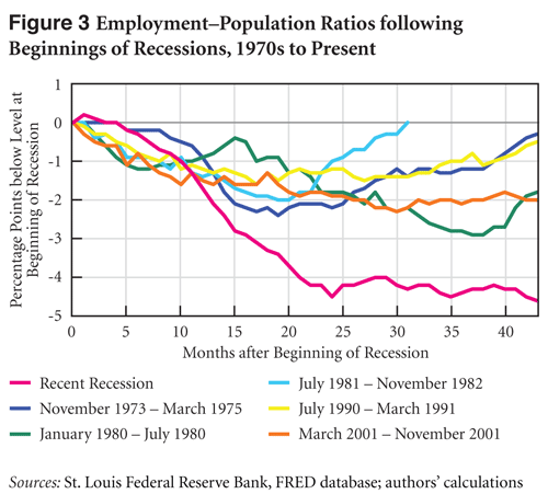
A new Levy Institute one-pager features some graphs that reveal a very weak recovery indeed, or even the start of a prolonged slump in economic growth and job creation, despite the fact that the recession ended in June 2009 by semi-official reckoning. Figure 3 in the new publication illustrates the country’s lack of progress in reversing recession-driven declines in the ratio of employment to the total civilian working-age population. Indeed, the figure shows that, according to the broadest figures available, the current employment problem is unprecedented in a period spanning back 40 years in terms of its overall size at the national level.
As the new one-pager states, Figure 3 shows
separate lines for the past six US recessions. Each line traces the path of the employment-to-population ratio relative to its level in the first month of each recession. The pink line corresponds to the most recent recession; it shows that, as of July, the ratio stood at 58.1 percent—4.6 percent less than at the recession’s start, 43 months earlier.


 ShareThis
First it was “recession”, then “great recession” and it´s looking more and more like a “depression”:
http://thefaintofheart.wordpress.com/2011/08/06/2914/
This was a March 2009 to June 2011 Federal Reserve push on a string recovery.
During the recovery corporation regained their cash positions. Some citizens lost their houses. some citizens maintained their debt obligations on overvalued houses which the corporations had sold them.
What next? Patterned Deflationary Collapse.
Saturation Macroeconomics:
There exists a global disparity in debt, ownership of debt, global real estate asset supply, real estate over valuation, western debt dependent consumption and eastern savings,massive trade imbalances dependent on eastern and western huge huge wage differentials, and 50 years of unsustainable corporate and taxpayer entitlements legislated by reelected politicians.
Is there a macroeconomic saturation point in saturation of supply and saturation of debt disparities that produces nonlinear transition periods?
In other words was the recent political intransigence and US debt downgrade merely an epiphoenomena of the global macroeconomic system’s unbalanced and saturated conditions?
Is the equity market following a nonlinear daily trading valuation pattern that confers on the system an equivalency of the laws of physics and the self assembly laws of chemistry and biology?
Wouldn’t it be marvelous even in the system’s collapse to determine that macroeconomic system had the characteristics and properties of a true science?
The financial asset class with the greatest market value and greatest global participation is the US debt instrument.
Observe the weekly composite equity and debt charts.
Equities are in the midst of a nonlinear collapse. US debt instruments
are the recipients of that nonlinear collapse and are in nonlinear growth
going to 150 year low interest rates.
For fifty years western debt expansion has been offset by
asset and wage inflation allowing further debt expansion. While there
are natural saturation limits to this process, the world macroeconomy
with the new Asian labor force participation has reached a
supersaturation point of debt and wage dysequilibrium.
50 years of entitlement promises – most disproportionally benefiting the financial and corporate industries who now go into the asset collapse laden with cash – have reelected Pavlovian politicians.
There is now a defacto consensus among US
(and eurobond) debt holders that austerity is needed to maintain the
quality of US debt. Qualitatively further debt expansion which drives
the real global economy is dead.
The deceleration in global GDP will be nonlinear. France’s quarterly GDP is one of the canaries in the coal mine.
Equities are undergoing exquisitely predictable Lammert quantitative
fractal collapse.
The daily fractal pattern for the first segment of the equity
collapse is 3/8/4 of 6-8/5 days.