The Sources of Personal Income Since 1947
(Click to enlarge.)
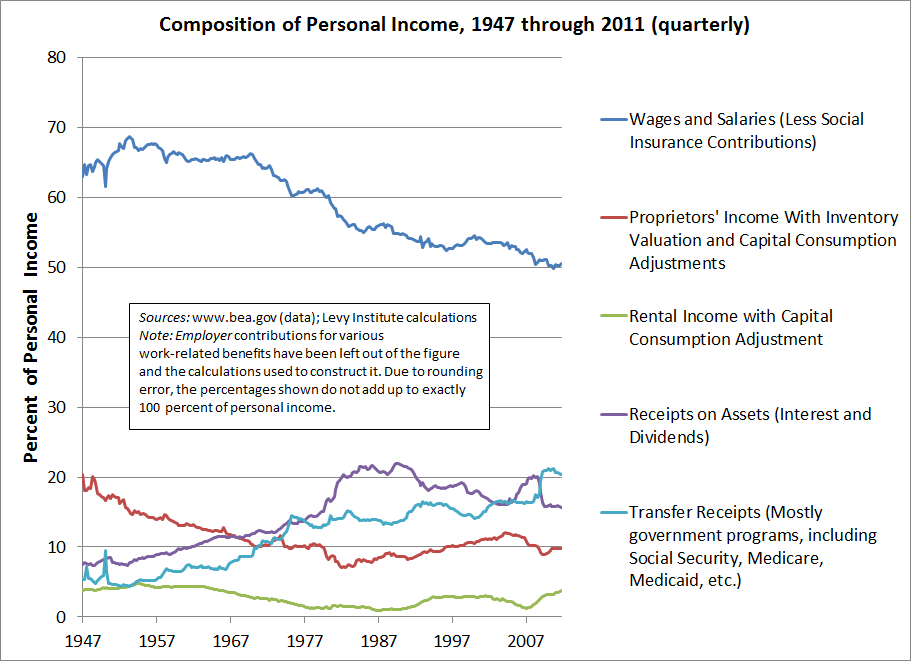
See the blue line in the upper half of the figure above? That line shows the portion of personal income made up of wage and salary disbursements, as a percentage of total personal income. (As the figure notes, I’ve subtracted social insurance contributions such as Social Security taxes. Also, employer contributions to Social Security, private pensions, etc., have been completely ignored in my calculations.) I have been looking into the possible effects on consumer spending of changes in the composition of income. Please click on figure if you want to see a larger version.


 ShareThis