Gross Government Expenditures Categorized
This figure shows how government spending as a percentage of GDP has evolved since 2000Q1. The numbers reflect the recent 5-year revision of the National Income and Product Accounts (the so-called “NIPA revisions”) and preliminary Q2 numbers, which are due for an update about a week from now.
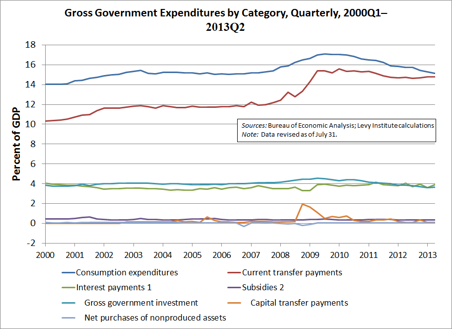
The figure shows that government consumption (at the top of the figure in blue) and gross investment (farther down, at about 4 percent of GDP in an aqua, or light blue, color) have been on a downward trend when expressed as percentages of GDP. Current transfer payments are depicted in red. They remain higher as a percentage of GDP than before the financial crisis; nonetheless, they are relatively flat. Government interest payments, in green, were well under control, in part because rates remained very low as of the end of Q2. The fixed-investment series is gross in the sense that it does not adjust for depreciation. Adding together all of these figures, total gross expenditures were 37.9 percent of GDP in Q2, less than a tenth of a percentage point (.1%) higher than in Q1. For a longer-term comparison, try a total of 42.3 percent in 2009Q2. Gross (and net) government spending has been falling for a long time. The sequester, whose effects are beginning to be reflected in official data, continues this trend.


 ShareThis